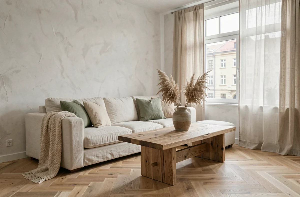
An apartment empty for three months, decent photos online, a price adjusted to the market, and yet no offers. We have seen this scenario repeat itself with properties where the interior decoration sent a dated or inconsistent signal to visitors. The problem goes beyond taste: real estate decoration affects the perception of volume, brightness, and the overall condition of a home. If poorly calibrated, it can result in several weeks of marketing loss.
Energy Performance Certificate and Real Estate Decoration: What to Address First
Before repainting a wall or changing a light fixture, check the energy class of the property. As of January 1, 2025, homes classified as G can no longer be offered under new leases, renewals, or tacit extensions. Class F homes will be affected in 2028, and class E in 2034.
A decoration project for a rental property classified as F or G is a poorly sequenced investment. First, renovate the insulation or heating system, then decorate. If the energy audit recommends replacing the windows, it’s better to include this item in the overall budget rather than spending on decoration only to dismantle everything later.
The share of homes classified as F or G among sales rose from 11% in 2021 to 17% in 2023, before stabilizing around 15% at the beginning of 2025. This means that a significant fraction of properties on the market has this constraint. You can learn more about Imagin’Air Déco to understand how to articulate renovation and enhancement of an interior in this context.
Color Palette by Room: The Rule of Three Shades Applied to the Field
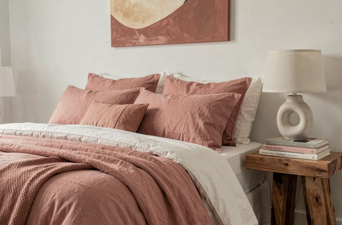
The theory of a maximum of three colors per room is widely circulated. In practice, we find that the main issue is not the number of colors but their distribution. A bedroom with a sage green wall, a white ceiling, and a light oak floor works well. The same bedroom with sage green on all four walls visually suffocates the space.
Concrete Distribution for a Living Room or Common Area
- A dominant color (walls and ceiling) that occupies about two-thirds of the visible surfaces, usually a neutral or light tone
- A secondary color (main furniture, curtains, rugs) that structures the gaze and gives character to the room
- An accent color (cushions, frames, decorative objects) that adds contrast without overwhelming the whole
For a kitchen, feedback varies on this point, but it is observed that overly bright shades on furniture facades tire faster than on a simple accent wall. If the project aims for a medium-term resale, it’s better to keep strong colors on easily replaceable elements.
Bedroom and Sleeping Area
In a bedroom, dull and matte tones promote a calming atmosphere. Monochrome (variations of the same shade) works well for small spaces. Avoid overly marked contrasts between the headboard wall and the rest of the room: the “accent wall” effect can unbalance a small space instead of enhancing it.
Layout and Brightness: Two Often Underutilized Levers of Real Estate Decoration
Painting is often the first thought. Space layout and light management produce a more significant effect, sometimes for a lower budget.
Circulation and Volumes in an Apartment
A piece of furniture placed perpendicular to the load-bearing wall in a medium-sized living room creates a visual separation without partitioning. Clearing the circulation axes between the door and the window significantly enlarges the perceived room. We see it at every visit: buyers instinctively move along these axes and judge the volume based on the distance traveled without obstacles.
Multi-Level Lighting
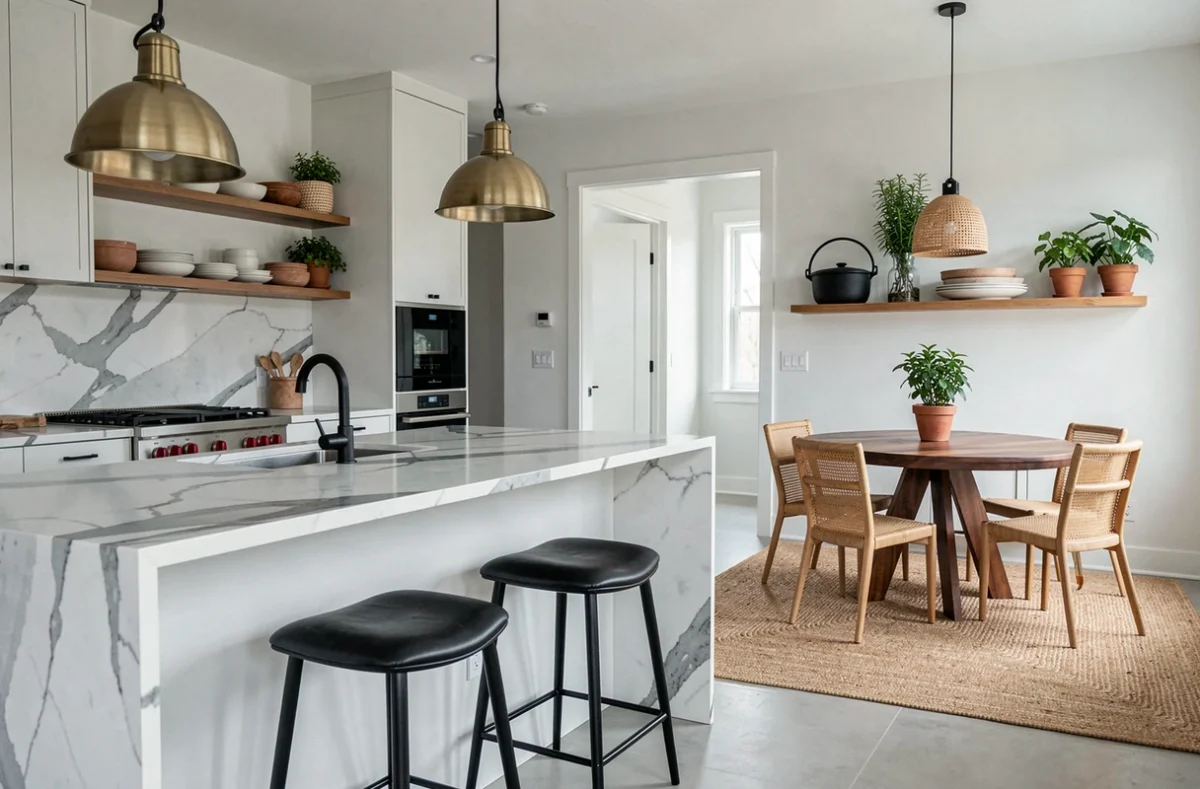
A single central ceiling light flattens volumes. The combination of indirect lighting (LED strip behind a piece of furniture, floor lamp) and functional lighting (pendant above the table, reading sconce) adds depth to each room.
- A mirror positioned facing a source of natural light redistributes brightness to dark areas without electrical additions
- Warm temperature lamps (around 2700 K) are suitable for living spaces, while the kitchen and worktop benefit from more neutral lighting
- A dimmer on the main light fixture in the living room allows for ambiance adjustment without multiplying sources
Decoration Trends and Resale: What Ages Poorly
Interior design follows cycles. Some very trendy decorative choices become markers of their time within a few years, complicating resale.
Textured wall coverings like stone cladding installed in living rooms at the beginning of the 2020s are starting to feel dated in the eyes of buyers. Panoramic wallpaper, omnipresent on social media, creates a spectacular effect in photos but divides opinions during physical visits.
In contrast, a floor made of neutral material (large format tiles, light wood), walls painted in classic tones, and furniture with simple lines withstand trends. This foundation allows for injecting trends through textiles and accessories, which can be replaced without renovation.
For a real estate decoration project aimed at enhancing a property before sale, controlled neutrality remains the safest choice. We decorate to broaden the target audience of potential buyers, not to express personal taste. The nuance is subtle but directly impacts the selling time and the price achieved.